First Visual
After many hours of trying to get Moodle and Flex with Flare to play nice, i finally have been able to get a simple visualization working using the grade book data from Moodle.
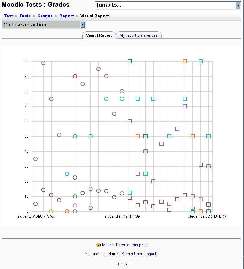
The first visual is a scatter plot of Normalized Grades vs Students. The different colors represent different items that have grades associated with them and the different shapes are the groups/sections the students are in. It’s not much to show for UI or labeling of the chart yet but provides a starting point to make the report/visual plug-in and has gotten me on my way learning the Flare API.
Hopefully i will have some more polished visuals and UI to show off in the coming weeks.
June 27th, 2008 at 11:30 am
[…] Servos has the first visuals from his grade stats plugin for […]